I’m not a designer. Design is a very ‘specific set of skills’ that are a balance of taste, experience, education and environment. Like any skill you need the ‘10,000’ hours to be an expert at it.
It’s not a thing that’s in my wheelhouse, but as a prospective indy app developer I need to do some sort of design. Whether that be the UI, color scheme, or…the app icon.
Now, what I should really do is stop being so cheap and get a professional to design it for me. But at this point in the app development lifeycle I don’t want to spend money on something that could very well end up being abandonware (at least I know myself). If I make my fortune, then I might well get a pro in.
For now, I’m going to have a crack at it…
I used this really brilliant app called Bakery by Jordi Bruin and after much clicking around and colour fiddling I came up with a placeholder icon that looked like this:
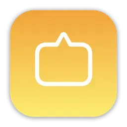
An upside-down message bubble, representing the feed of message-y notes, seemed to fit the bill. This gave me something on my home screen that wasn’t the out of the box icon. Kind of made it feel like a real thing.
I used this placeholder for a while and riffed on the idea with a couple of sketches…
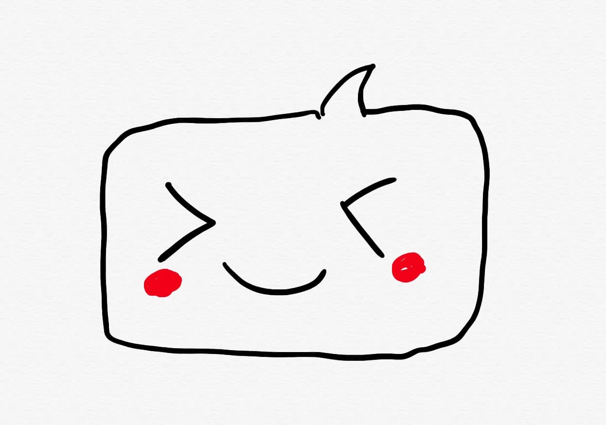
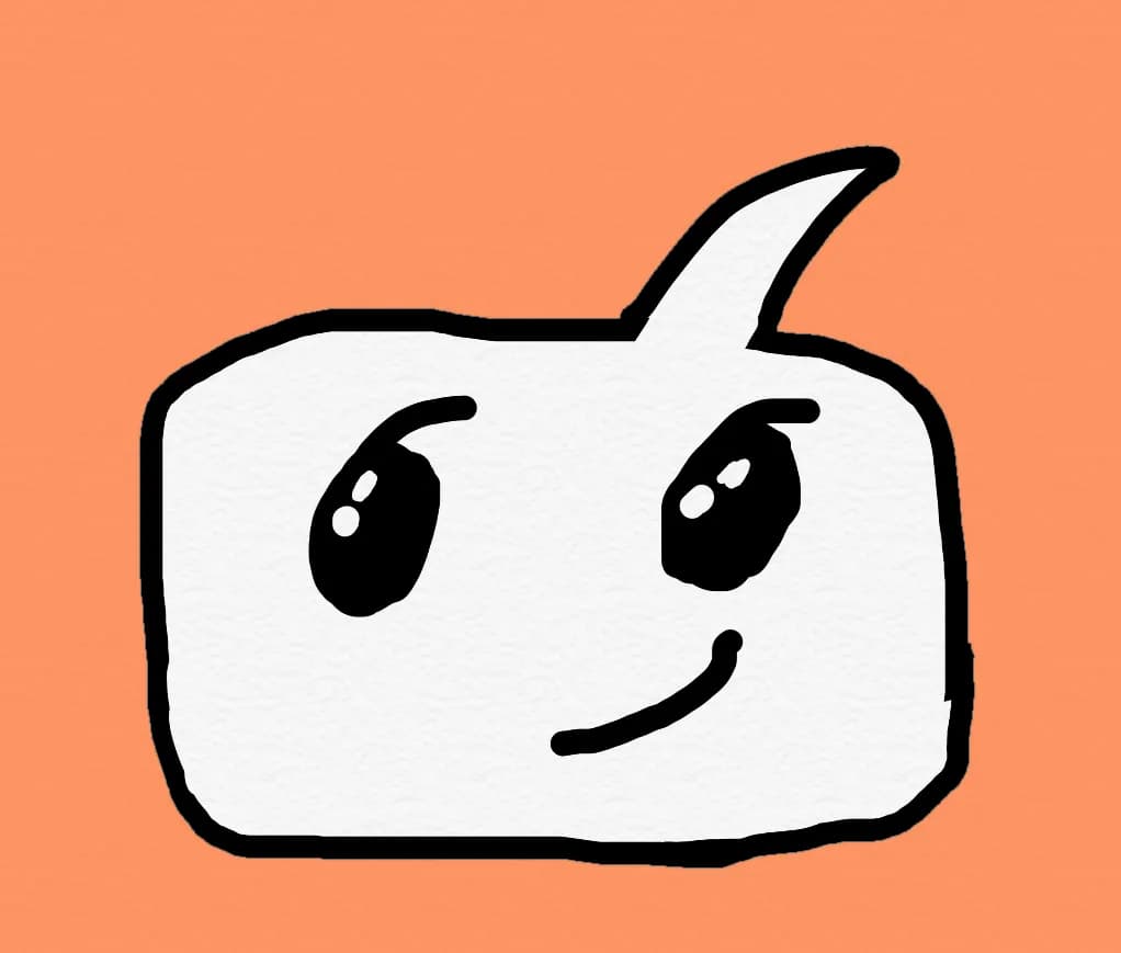
…as you can see, my drawing skills are not great!
I quite liked the idea, so I decided to move over to Sketch and turn this roughness into somethign a little nicer.
After hours of tweaking, poking, Googling etc… I landed on the following:
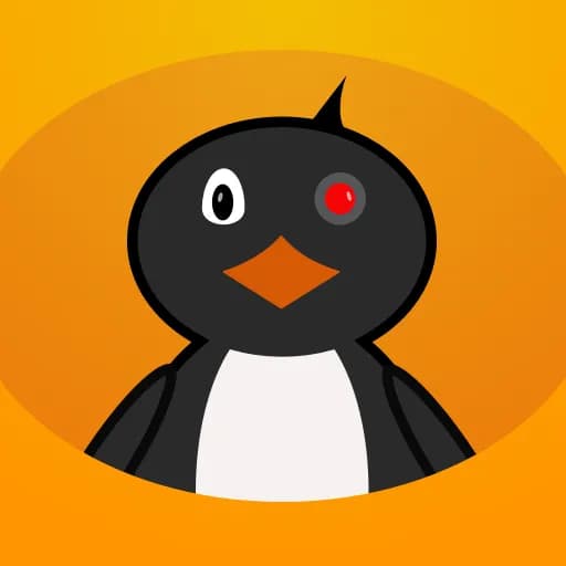
Yeah, a blo*dy penguin!
Seems I got distracted by my own brain. I spent years watching Pingu with my kids (I really like it and I’ll watch it now even though my kids are older and have moved on to other things) and came up with what can only be described as a ‘reimagination’ of the famous bird.
The family liked it, and it’s kind of cute. So maybe we should go with it?
Well, it turns out that when you load it on the device, the colours and the detailing in a small app icon looks kind of rubbish - it was not a good design and it’s uselessness saved me from being laughed at by anyone subjected to it.
Disgusted with myself I returned back to the original idea and eventually came up with this:
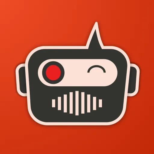
I have another app that I’ve been (cough) working on for a while (not quite abandoware, but close) and it has a robot motiff to it. So this icon would fit in nicely with the ‘portfolio’
I’m happy enough with this, and for now this is my final best offer.
The moral of the story?
Don’t hire me to create your icons.
—MrB